


PREAMP

PREAMP
PROJECT OVERVIEW
This one started with a personal frustration.
I kept missing album releases—either because I forgot the date or I just didn’t see it in time. It’s a small thing, but it happens a lot. And I realized I wasn’t the only one. Most music apps focus on streaming or discovery. But not many make pre-ordering easy or even visible.
So I built Preamp.
It’s a concept app I created during my Google UX Design Certificate, and the idea was pretty direct: a simple way to track upcoming music and lock in pre-orders before they disappear. No clutter. No ads. Just something that worked.
MY ROLE
I did all the UX and UI work myself—research, wireframes, prototypes, and user testing.
This was a solo project, so I wore every hat, which I like. You get to follow your own logic all the way through, even when it leads you somewhere unexpected. Sometimes I’d sketch out a screen only to scrap it the next day. Other times, I’d just tweak one button and the whole flow would suddenly click.
WORKFLOW
User interviews, Empathy maps, Persona creation, Journey mapping, Paper wireframes, Digital wireframes, Low-fi prototype, User testing, Feedback updates, High-fi design, Accessibility tweaks, UI copywriting, Visual design.
THE PROBLEM
People love music. But keeping up with it? That’s harder than it should be.
I spoke with users aged 15 to 60—students, professionals, long-time collectors—and the feedback followed the same thread: too many platforms, too much noise, not enough clarity. They weren’t asking for more features. They just wanted less friction.
To organize what I heard, I created an Empathy Map. Time constraints came up often. People forgot release dates or didn’t have the energy to chase them down. Discovery was another issue—apps either felt algorithmically generic or too cluttered to navigate.

COMPETITIVE ANALYSIS
Before designing Preamp, I wanted to understand what existing music platforms were doing well—and where they were falling short. So I looked at three major players: Spotify, Bandcamp, and Amazon Music. Each had strengths, but none fully solved the specific problem Preamp was built around: tracking and pre-ordering music in a clean, personal way.


Spotify was a natural starting point. It’s built for everyday listeners and hardcore fans alike, with a simple, familiar interface. The recommendation engine is a standout, but things fall apart when you want more control—like better curation, release alerts, or meaningful discovery outside the mainstream. It’s fast until it’s not. It’s clean until it feels generic. And for visually impaired users, accessibility still feels buried.
Bandcamp was a different kind of model. It’s built around independent artists and smaller audiences, with a DIY spirit that gives artists freedom to personalize their pages. That’s great for connection—but the trade-off is clutter. Navigation gets messy. Filters are limited. And while the ethos is strong, the site can feel inconsistent from one artist to the next. Still, it’s one of the few platforms that actually encourages fan engagement.
Amazon Music felt more functional than musical. It’s huge—millions of songs, full Alexa integration, and broad device support. But it lacks soul. The experience is efficient, but impersonal. Social features are limited. Music discovery feels like an afterthought. And the interface, while familiar, leans outdated and crowded. It works, but it doesn’t invite you in.
Looking at all three, the opportunity was clear: users wanted a place that offered better discovery, real personalization, and less clutter. Preamp wasn’t trying to be everything—it just had to be the one thing done well.
PERSONAS
Before building anything, I needed to understand who I was designing for. So I spoke to a wide range of users—students, professionals, collectors. People who love music but don’t always have the time or tools to keep up. Their habits weren’t the same, but their problems were. Missed releases, cluttered apps, too much noise. These three personas reflect the users who shaped this project. Not perfectly, but close enough to design around.


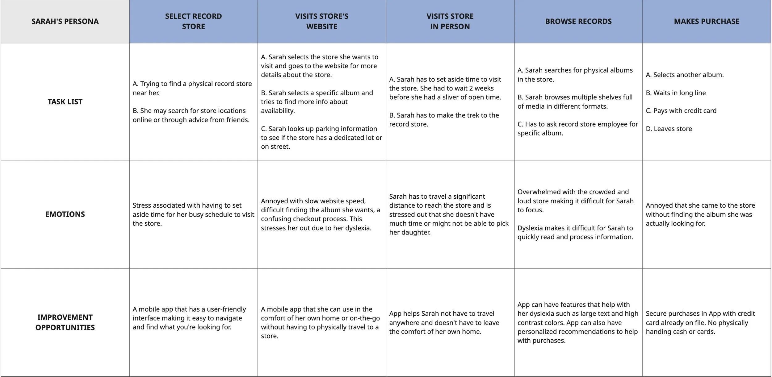
THE USER JOURNEY
For this step I focused on Sarah specifically. To understand Sarah’s experience, I mapped out her typical music discovery routine. For years, she relied on record stores—browsing shelves on weekends, chatting with staff, stumbling onto new releases in person. That was her rhythm. But lately, with a busier schedule, those visits have become rare. She still wants that sense of discovery, but without the time or space to do it in person, she’s left feeling disconnected. The journey map helped highlight what’s missing—not just the music, but the experience of finding it in a way that feels intentional and rewarding. That gap is what this product needed to fill.
WIREFRAMES
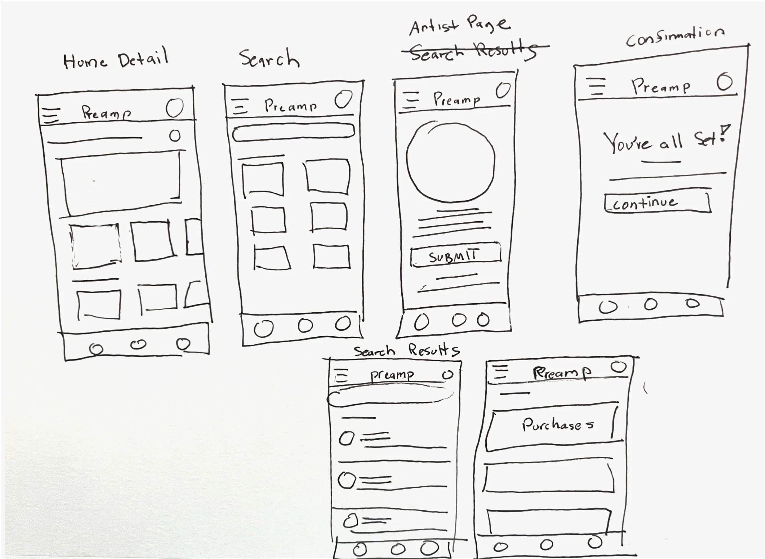
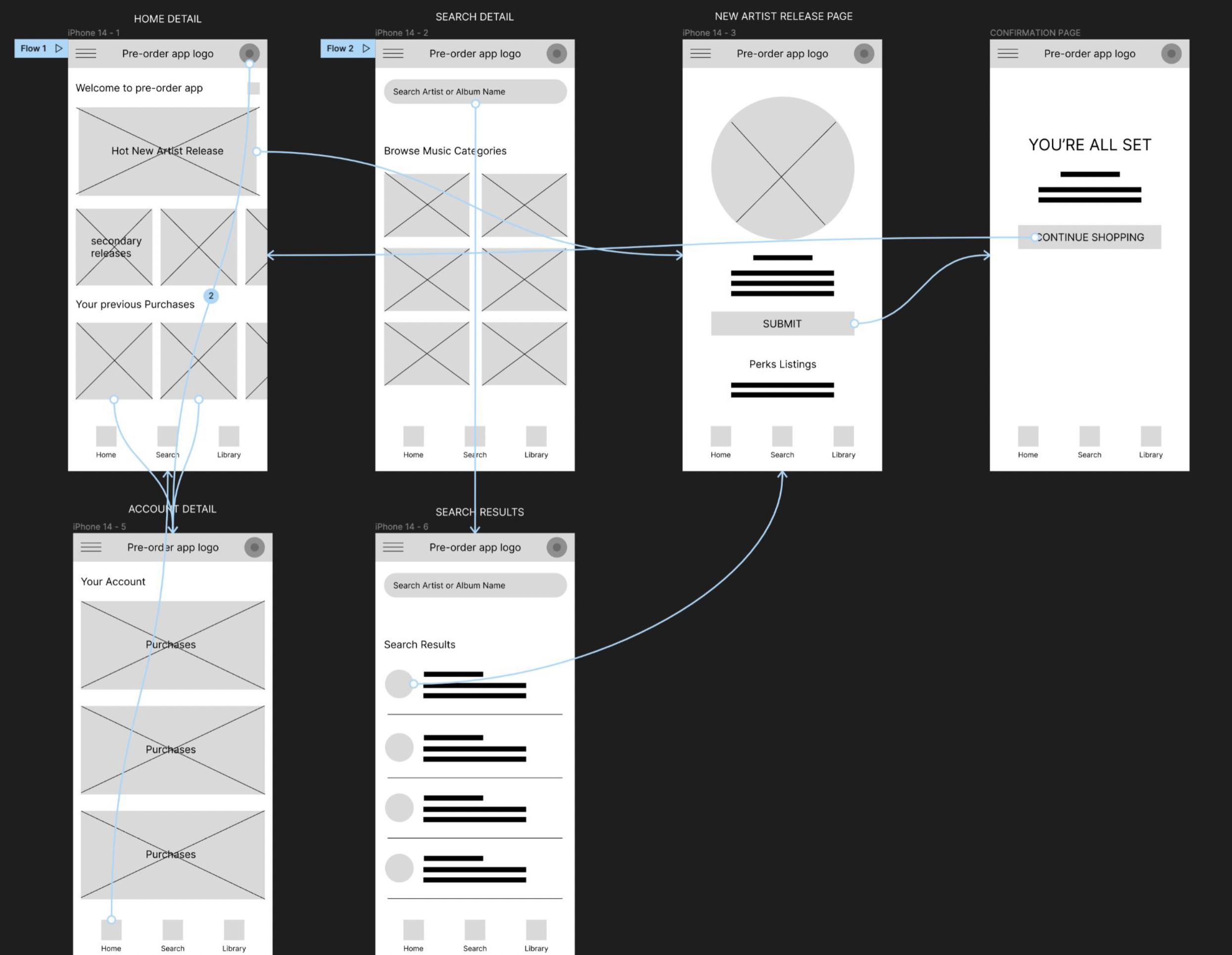
I started on paper. It’s fast, low-pressure, and lets ideas take shape without getting stuck on polish. I sketched core flows—browsing, pre-ordering, setting preferences—and crossed things out when they didn’t work. Once the structure felt solid, I moved into low-fidelity digital wireframes. This helped me test flow, catch weak points, and start getting feedback. Some screens felt off. Others just needed small adjustments. After a few rounds of edits, I built high-fidelity mockups. These were sharper—real layout, real type, real color. Still simple, still clean, but more intentional. Not just how it worked, but how it felt.
USABILITY STUDY
After building out my paper and low-fidelity wireframes, I ran two rounds of usability testing to see how people actually moved through the product. Not what they said they’d do—but what they did when the screen was in front of them. It wasn’t about catching flaws. It was about spotting friction. Things that felt small to me ended up blocking the flow entirely for users.
USABILITY ROUND 1 FINDINGS
More variety: People wanted to see a wider range of upcoming releases, not just mainstream options. They expected more depth.
Simpler navigation: The flow felt cluttered. Users hesitated or second-guessed where to tap next. It needed to be cleaner.
Social sharing: A few users mentioned wanting to share new releases with friends or post what they pre-ordered. That wasn’t something I planned for initially.
USABILITY ROUND 2 FINDINGS
Artist following felt unclear: Users weren’t sure how to add or follow artists, which broke the whole point of getting personalized release recommendations.
Onboarding wasn’t obvious: Users missed the onboarding prompt and didn’t know it existed
Unclear Interactions: Some UI elements looked clickable but weren’t—created hesitation
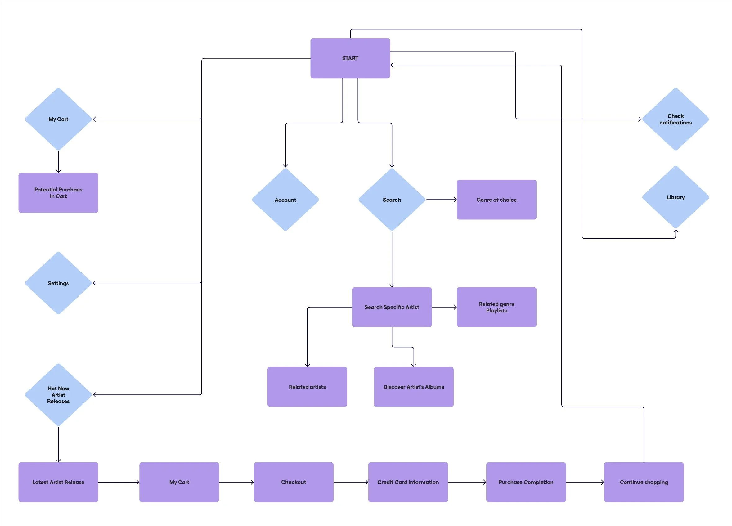
USER FLOW
Before getting into the visual design, I needed to map out how someone would actually move through the app. Step by step. No assumptions. Just the basic path—from landing on the home screen to pre-ordering an album. This helped me spot what was missing, where things could break, and how to keep the experience simple without losing purpose.
HI-FI PROTOYPES
The final high-fidelity prototype brought everything together. Flows were cleaner, the layout felt more focused, and small moments—like pre-ordering or checking out—moved faster. Every screen was shaped by what users had struggled with earlier. The goal wasn’t to impress—it was to make it clear, fast, and easy to use.
USABILITY ROUND 3 FINDINGS
After testing, I made a small but important change. When the app launches for the first time, a quick pop-up now asks users to pick their preferred format, genre, and a few favorite artists. This gives the app enough info to recommend relevant releases and send notifications that actually matter. It’s short, simple, and helps the app feel personal from the start.

ACCESSIBILITY CONSIDERATIONS
I kept accessibility in mind throughout the design process. Nothing complex—just a few decisions that make the app easier to use for more people.
Color choices: I used UI-approved color contrasts to support users with vision impairments. It helps with readability and makes sure key actions stand out.
Alt text: Every image includes alt text so screen readers can describe what’s on the screen. This supports blind and low-vision users navigating non-visual content.
Native icons: I used built-in, familiar icons to reduce the learning curve. Users shouldn’t have to guess what a button does.
Recognizable visuals: Album covers and artist photos are paired with simple text labels. This helps users identify content quickly—even if images don’t load or get skipped by assistive tech.
KEY TAKEAWAYS
Looking back, a few things stood out. Some choices landed well. Others needed rethinking. That’s the point. This wasn’t about building something perfect—it was about making something better every step of the way.
Impact: The app now feels more personal. Users can set preferences early, get better recommendations, and move through the flow without getting lost. It’s faster, cleaner, and more relevant to what they care about.
What I learned: Testing matters. The final design fixed key issues—especially around search and onboarding. Giving users more control made the experience feel more focused and less frustrating. It wasn’t about adding more—it was about making what was there work.
NEXT STEPS
The design’s in a good place, but there’s still more to figure out. A few features could be pushed further. Some decisions could be tested, not just assumed. These are the next things I’d focus on.
Run more usability studies: Now that the high-fidelity prototype is in place, I’d test it with a broader group. Different devices, different levels of music knowledge. The goal is to catch edge cases and refine the flow even more.
A/B test design choices: There are a few areas—like the onboarding prompt and card layout—that could benefit from A/B testing. It’s not always obvious what works best until people start clicking.
Send out a short survey: I’d gather feedback on what features users actually use, what they ignore, and what they wish was there. Surveys are great for spotting patterns early, especially if the app were to move into development.
These aren’t major overhauls. Just smart steps to move the design from solid to sharper.